Nasdaq Nasdaq 101

November 20, 2009

TRENDLINES AND 50% RETRACEMENTS REACHED

By John Murphy

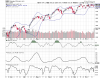
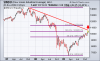
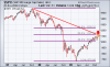
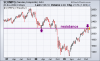
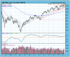
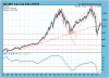
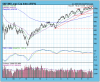
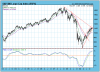
The following three charts show the three major U.S. stock indexes having reached formidable overhead resistance barriers. Charts 1 and 2 show the Dow Industrials and the S&P 500 having retraced 50% of their bear market declines. More importantly, both indexes are testing major down trendlines drawn over 2007/2008 peaks. Given the fact that the market has rallied 60% in the last eight months without a meaningful correction, that's some cause for concern. Chart 3 shows a slightly different picture for the Nasdaq market, but the message is essentially the same. The Nasdaq Composite has reached important overhead resistance along its early 2008 trough around 2200. That puts all three stocks up against meaningful resistance barriers. Combined with the fact that numerous short-term divergences are starting to appear among market groups, and the recent rotation toward large-cap stocks in the consumer staple and healthcare categories, it looks like investors are starting to lock in or protect some yearend profits. That could lead to choppier market conditions
 

Allegati

  • 6a0105370026df970c0120a6bdb7c9970b-800wi.png
    6a0105370026df970c0120a6bdb7c9970b-800wi.png
    16,6 KB · Visite: 348
  • 6a0105370026df970c0120a6bdb7eb970b-800wi.png
    6a0105370026df970c0120a6bdb7eb970b-800wi.png
    17,2 KB · Visite: 369
  • 6a0105370026df970c012875bf7401970c-800wi.png
    6a0105370026df970c012875bf7401970c-800wi.png
    15 KB · Visite: 338
Mercato Statunitense "tosto"......che abbia ragione il Guru?
N.B. i grafici sono aggiornati al momento in cui posto.

Expecting Upside Breakout
by Carl Swenlin
December 4, 2009
On Thanksgiving Day Dubai announced that it would be delaying loan payments by six months. This resulted in a global selloff, in which the U.S. markets participated on the following day. There was virtually no follow through selling this week. Looking at the S&P 500 chart below, you can see that the Dubai selloff is practically invisible within the context of the trading range of the last several weeks. In fact, the market is consolidating during a time when I had expected it to be declining into the 20-Week Cycle low. Because of this I have had to reconsider my cycle assessment: It appears that the 20-Week Cycle low occurred on November 1, about three weeks ahead of schedule. Early or late arrival is a frequent occurrence, but not something we can know until after the fact. All we can do is adjust accordingly. At this point, I think a new 20-Week Cycle began on November 1. The next major cycle-related correction low is projected for April 10, 2010 when the 9-Month Cycle is due to bottom.
Let's look at the chart again. What I see is a flag pole (the rally from the November low) and flag (the recent three-week consolidation). The technical expectation from this formation is an upside breakout with an initial target of about 1180. We are in a bull market with the market behaving extremely well, so I have high confidence in this outlook. If prices drop below the bottom of the flag, breakout expectations would be negated.
 

Allegati

  • SharpChartv05.png
    SharpChartv05.png
    30,2 KB · Visite: 352
Next is a monthly chart of the S&P 500, and it contains some very bullish evidence. The monthly PMO (Price Momentum Oscillator) is rising off a very oversold reading (lowest since 1932), and it has crossed up through its 10-month moving average. There are only four other deeply oversold PMO bottoms since 1929, and all were associated with new bull markets. Four data points in 90 years is a thoroughly inadequate statistical base from which to draw conclusions, but, understanding how the PMO works, I think the bull market is likely to continue for at least a year and could easily challenge previous all-time highs. Be advised, however, the positive long-term picture does not eliminate the possibility of substantial corrections along the way, but a smoothly rising monthly PMO presents a solidly positive long-term technical picture.
Bottom Line: Technically, the market is showing solid strength, but the bull market is running strictly on speculation and emotion, and there is virtually no fundamental support under the market. The Dubai event is a good example of the kind of thing that has the potential to start an avalanche of selling. There are probably hundreds of them waiting in the bushes. Taken one at a time, they may only cause a momentary ripple. If too many pop out at one time, it could end in disaster.
 

Allegati

  • sharp.png
    sharp.png
    23,5 KB · Visite: 335
Analysis of Three Time Frames
by Carl Swenlin
December 18, 2009

Since this will be our last article for 2009, I thought it would be appropriate to do an analysis of the short-, medium-, and long-term charts and synthesize a broad outlook for the market.
In my December 4 article I said we should expect an upside breakout, but the market has continued to consolidate in a very narrow range, still testing the long-term overhead resistance which is drawn across the declining tops beginning with the 2007 top. In the short term, we are looking at several weeks of consolidation, which is also known as a continuation pattern. This means that the most likely resolution will be an upside breakout that will continue the rally that began from the November lows. There is also the issue of the ascending wedge pattern, which normally breaks to the downside. Should that happen, there is support at about 1050, on the botom of the slightly rising trend channel. Because the two prominent short-term set ups are in opposition, I would have to say that the short-term (days to weeks) picture is neutral.
 

Allegati

  • SharpChartv05.png
    SharpChartv05.png
    26,1 KB · Visite: 343
With two opposing possible short-term outcomes, let's look at the weekly chart, which gives us a medium-term (weeks to months) view of the market. This chart looks bearish. We can see price stalling at resistance, and the PMO is overbought and trying to roll over. The strongest message from this chart is that a medium-term correction is about to begin.
 

Allegati

  • SharpChartv06.png
    SharpChartv06.png
    24,6 KB · Visite: 344
Finally, the monthly chart looks very bullish for the long term (months to years). I say that primarily because the PMO has turned up from a deeply oversold reading and has passed up through its 10-EMA. This is about as bullish a picture as you are likely to see on a monthly chart. Keep in mind that this doesn't override the medium-term or short-term picture. If you study the chart carefully, you will see that quite violent price swings can occur without causing the monthly PMO to change direction. Nevertheless, the overriding message is that the long-term direction of the market is most likely to be up.

Bottom Line: The short-term chart presents two opposite possible outcomes, but the medium-term (stronger) time frame points toward a correction of modest duration; therefore, an upside breakout is unlikely to be sustained. The long-term (strongest) chart tells us that, regardless of how severe a correction we experience, the bull market will ultimately prevail.

Carl Swenlin
 

Allegati

  • SharpChartv07.png
    SharpChartv07.png
    21,4 KB · Visite: 351
La posizione sul Nasdaq 100 rimane ancora flat, in attesa che la situazione si chiarisca: la compressione della volatilità comunque inizia a raggiungere discreti livelli......quindi o :up: o :down:......comunque mi pare che l'intervento di Swenlin sopra riportato possa fornire qualche utile spunto di riflessione in proposito :)
 

Allegati

  • sc.png
    sc.png
    35,9 KB · Visite: 323
Ma allora crolla tutto! :D
Comunque siamo pronti alla prossima operazione suicida (simulata, come sempre, mi raccomando!).
Acquisteremo l'indice nasdaq 100 in chiusura, se la situazione rimane più o meno a questi livelli (RSI 3gg 12,75, con conferma di Stoch-Rsi di breve periodo).
 

Users who are viewing this thread

Back
Alto