Di questo poi se ne può parlare:
The US government can buy as much of its own debt as it chooses | Bill Mitchell ? billy blog
This is is a guest post from Philip Pilkington, a writer and research assistant at Kingston University.
Over the past few years some quarters of the financial commentariat have taken to describing the Federal Reserve’s asset purchases as the monetisation of US national debt, something which has given rise to all sorts of misguided fears about inflation and much else.
While the Fed certainly have been purchasing extensive amounts of government debt in the secondary markets it is perhaps misleading to assume that these markets would not otherwise be buoyant without such intervention.
Bill Mitchell, an
Australian macroeconomist and one of the founding fathers of Modern Monetary Theory (MMT) posted an interesting piece on this the the other day where he broke down who really holds the bulk of US national debt. The results were somewhat surprising.
Collectively, it turns out, official US government holdings (the Fed and other state bodies) have
in percentage terms decreased since the 2008 crisis while private holdings, inclusive of foreign holdings, have gone up. For the purpose of further clarity, the graph below shows the data set out in a slightly different way to Mitchell’s. Where he included foreign holdings as a component of private holdings, they have now been separated:

The chart is compiled using the US Treasury’s Financial Management Services’ (FMS)
Ownership of Foreign Securities data and takes Fed/Other Government to include Federal Reserve and other Federal government accounts; state and local holdings; and state and local pension holdings. This reflects the amount held in total by the US government and central bank.
Foreign holdings, meanwhile, are aggregated in the data with the private sector broken out.
It seems clear that as a percentage of the national debt the Federal Reserve and governmental holdings have fallen substantially – a trend that interestingly began well before the crisis of 2008, and which was only subsequently reinforced.
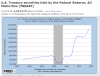
The Fed’s holdings isolated from the rest of the US government meanwhile look like this:

Note that in December of 2003 Fed holdings represented 51.7 per cent of total national debt, while in December of 2012 they represented only 39.7 per cent.
We cannot break down the foreign sector using the data from the FMS, but we can break down the private sector which gives us a hint of why this trend might be taking place:
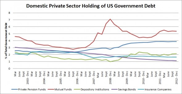
As can be seen, it was pension funds and mutual funds which increased their share of the national debt most. This falls in line with the general flight to safety narrative we’ve all heard about , calling into question many of the fears raised by the ‘debt monetisation’/hyperinflation crowd.
It’s also worth noting that while savings bonds have decreased substantially this trend seems to stretch back to long before the crisis reflecting a broader trend falling real savings rate (as opposed to the paying down of debt).
Either way, it looks like there are plenty of buyers both at home and abroad for US government debt and this is unlikely to change much even if the tapering program is initiated. Why? Because many investors aren’t investing in the real economy right now and this goes a long way to explaining our present output and unemployment problems.
Watching the Wrong Central Bank - 5 ducats


")

